Quick CPU User Interface Settings and Controls
Quick CPU User Interface Functionality
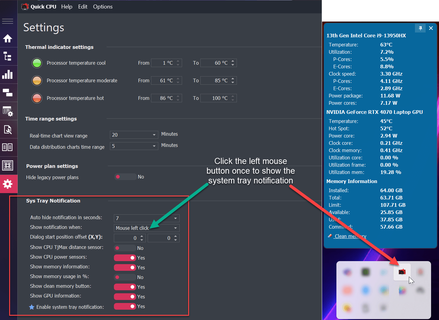
System Tray Notification Popup
The System Tray Notification Popup provides a quick and accessible way to monitor CPU, Memory, and GPU statistics directly from the system tray. By default, the popup can be triggered with a single left mouse click on the application's system tray icon.
Popup Behavior
- Default Trigger: Clicking the left mouse button once on the system tray icon opens the popup dialog.
- Auto-Hide Mode: The popup appears in auto-hide mode by default and will automatically close after a user-defined interval unless it is pinned.
- Pin Feature: Clicking the pin icon located in the upper-right corner of the popup will keep it visible until manually closed by the user.
Configuration Options
Users can customize several aspects of the System Tray Notification Popup through the application's settings. Available configuration parameters include:
- Auto-Hide Notification (seconds): Sets the duration in seconds after which the popup will close automatically if it is not pinned.
- Show Notification When: Specifies the user action that triggers the popup. The default is a single left mouse click.
- Popup Dialog Start Position: Allows the user to define the X and Y offset (in pixels) from the main taskbar for positioning the popup.
- Show CPU TjMax Distance Sensor: Enables the display of the TjMax distance (temperature margin to thermal junction max) on the popup.
- Show CPU Power Sensors: Adds CPU power consumption readings to the popup display.
- Show Memory Information: Displays system memory statistics, including total and available memory.
- Show Memory Usage in %: Displays memory usage as a percentage instead of gigabytes.
- Show Clean Memory Button: Shows or hides a button within the popup that allows users to initiate memory cleanup.
- Show GPU Information: Enables the display of GPU monitoring data, including usage and temperature if supported.
- Enable System Tray Notification: Enables or disables the System Tray Notification Popup feature entirely.
Use Case
This feature is especially useful for users who want to monitor real-time system performance without opening the full application. The ability to pin the popup or trigger it with a quick click allows for efficient monitoring during gaming, content creation, or other performance-intensive tasks.
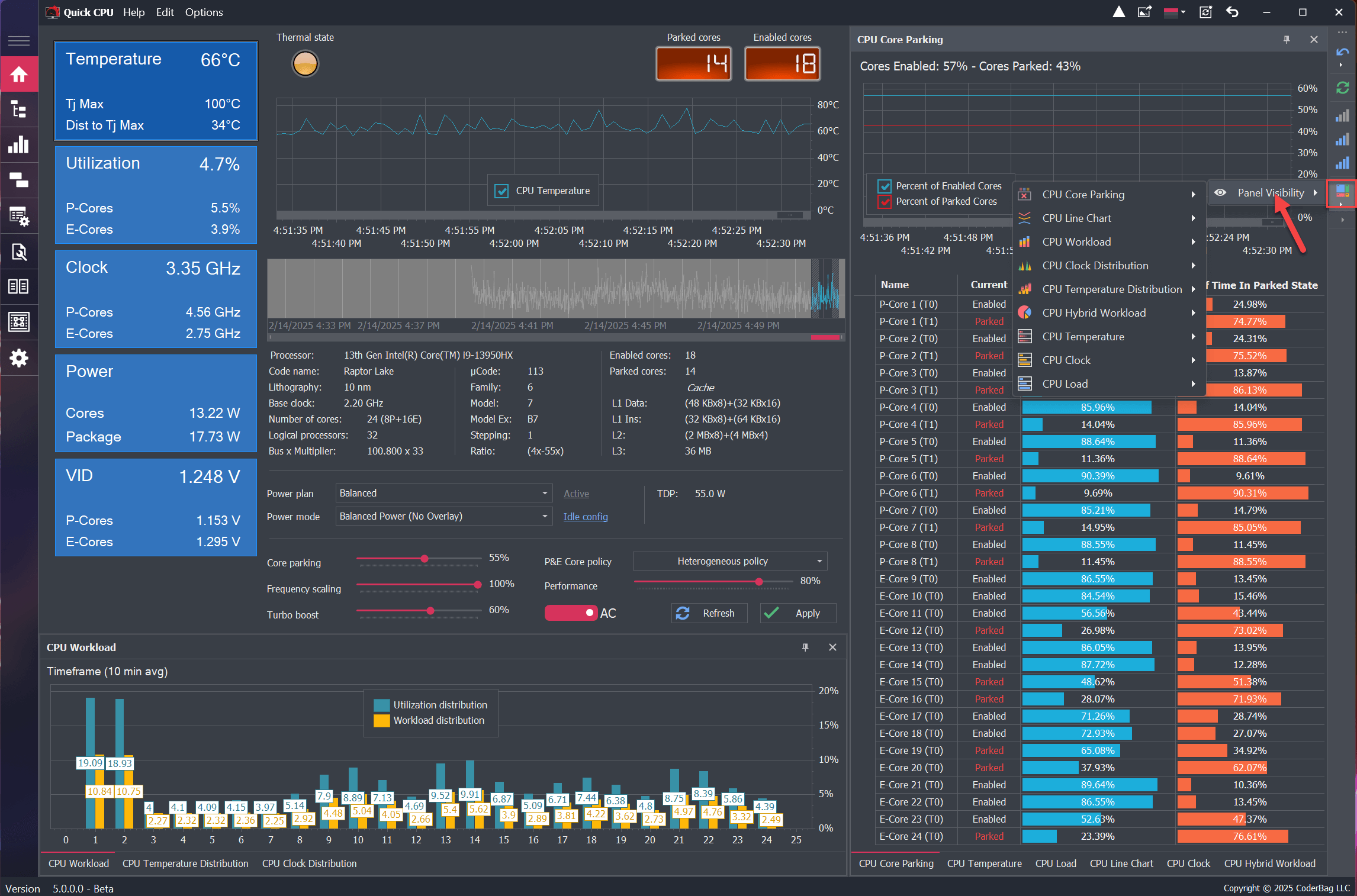
User Interface Layout Customization and Dockable Panels
In Quick CPU version 5, most controls implement a modular user interface, consisting of multiple dockable panels, each designed to display specific information.
The number and types of panels available on a system depend on the platform and may vary based on the processor and other hardware configurations.
The layout of the application is highly customizable—users can easily move dockable panels to custom locations within the application UI by simply dragging and dropping them. Additionally, each panel can be completely detached from the main UI if desired.
By default, Quick CPU starts with certain panels hidden to optimize space in the dock panel toolbar. Users can show or hide panels by either:
- Closing the panel
- Using the toolbar menu to enable panel visibility (See Image Below)
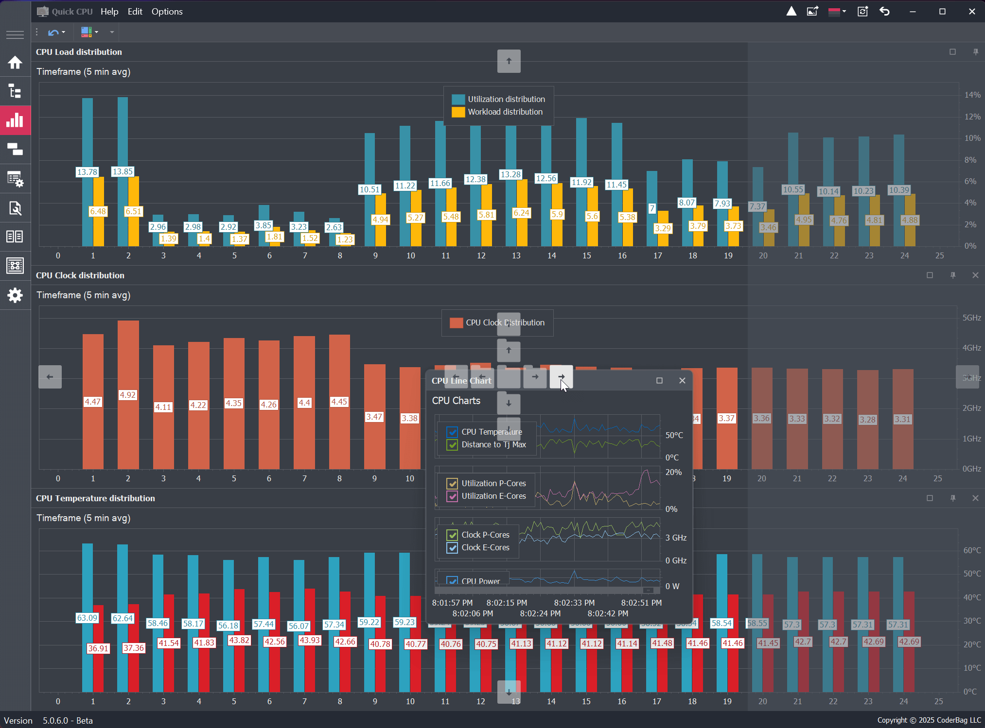
Default Hidden Panels by Processor Type:
- Intel CPUs: The CPU Clock Distribution and CPU Temperature Distribution panels are hidden by default.
- AMD Ryzen CPUs: The CPU Clock Distribution panel is hidden by default.
As mentioned earlier, users can enable or disable panel visibility at any time.
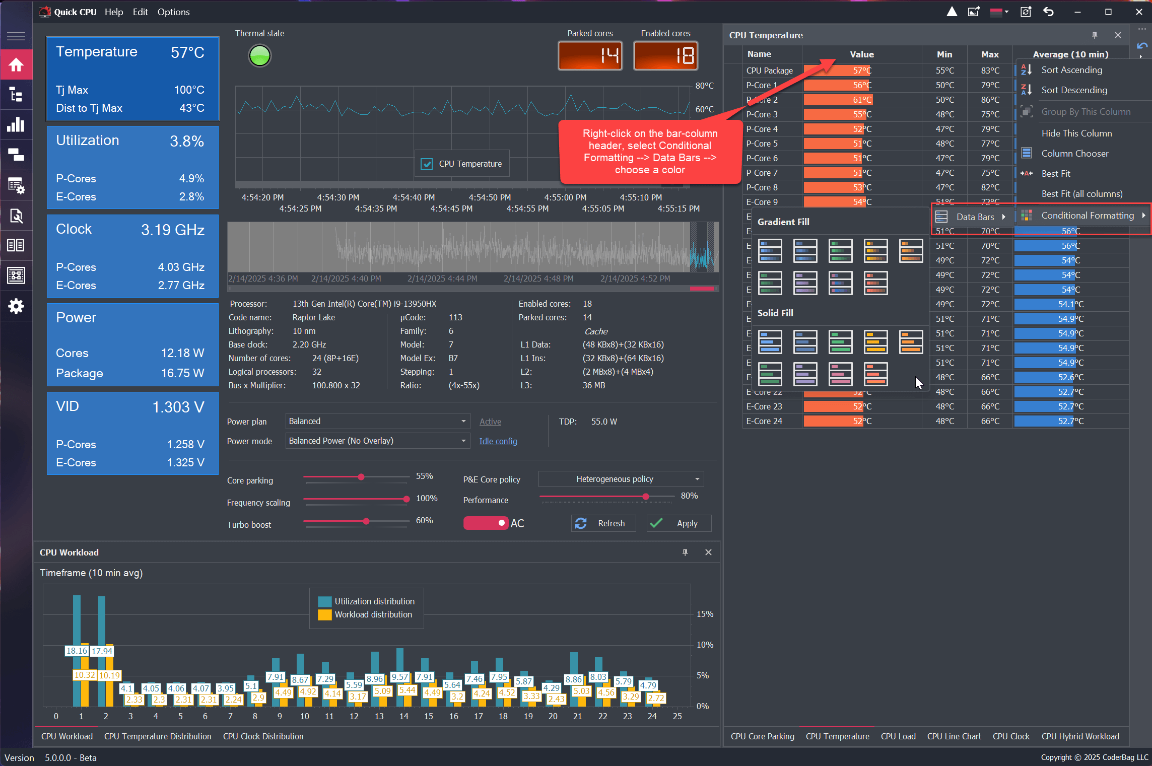
Data Bar Color Customization in Data Grids
Quick CPU uses data bar columns to improve the visual representation of key parameters such as:
- CPU Temperature
- Clock Speed
- Power Consumption
- Utilization
Users with a Pro version can fully customize the data bar colors for each column, choosing from a variety of gradient or solid color options.
This feature is only available in the Pro version.
CPU Data Distribution Chart Panel
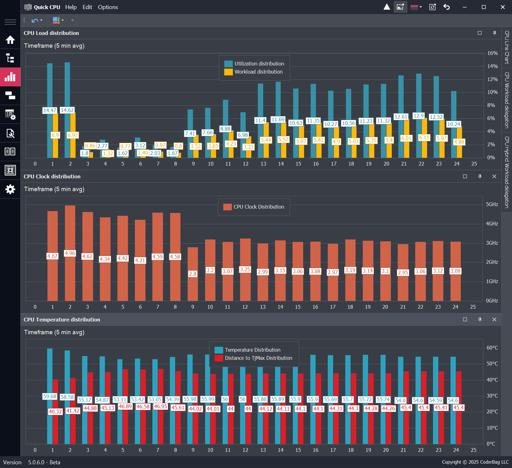
The CPU Data Distribution section provides multiple individual panels, each containing a chart that visualizes how key performance and thermal metrics are distributed across individual CPU cores. These charts help users assess how evenly workload, temperature, clock frequency, and power are managed across the processor.
The availability of each chart depends on the specific CPU model and architecture. If a chart is not supported by your processor, it may be hidden from view.
Available Charts
- Load Distribution: Displays how CPU usage is distributed across all cores. Each bar reflects the average utilization (as a percentage of total core capacity) for a specific core.
- Temperature Distribution: Shows how temperature is distributed across all CPU cores, helping identify thermal imbalances or hotspots.
- Clock Distribution: Illustrates how clock frequency is distributed among CPU cores, providing insight into dynamic frequency scaling behavior.
- Power Distribution: Displays how electrical power consumption is distributed across all cores.
Chart Behavior and Configuration
Each chart panel presents average values per core over a configurable time window. By default, the time range is set to 10 minutes. If the application has been running for less than the selected time range, the charts will reflect the data collected so far.
To adjust the averaging window, go to: Settings → Time Range Settings → Data Distribution Chart Time Range. For example, setting this value to 5 minutes will calculate the per-core average over the most recent 5-minute window.
Interactive Features
- Each bar in the chart represents a physical CPU core.
- Hovering over a bar will display detailed metrics for that core.
- Each chart updates dynamically and independently, helping to identify irregularities or uneven distribution in real time.
These charts are particularly useful for diagnosing CPU-related performance bottlenecks, thermal distribution issues, or assessing how effectively multi-threaded workloads are being distributed.
CPU Workload Delegation Pie-Chart Panel
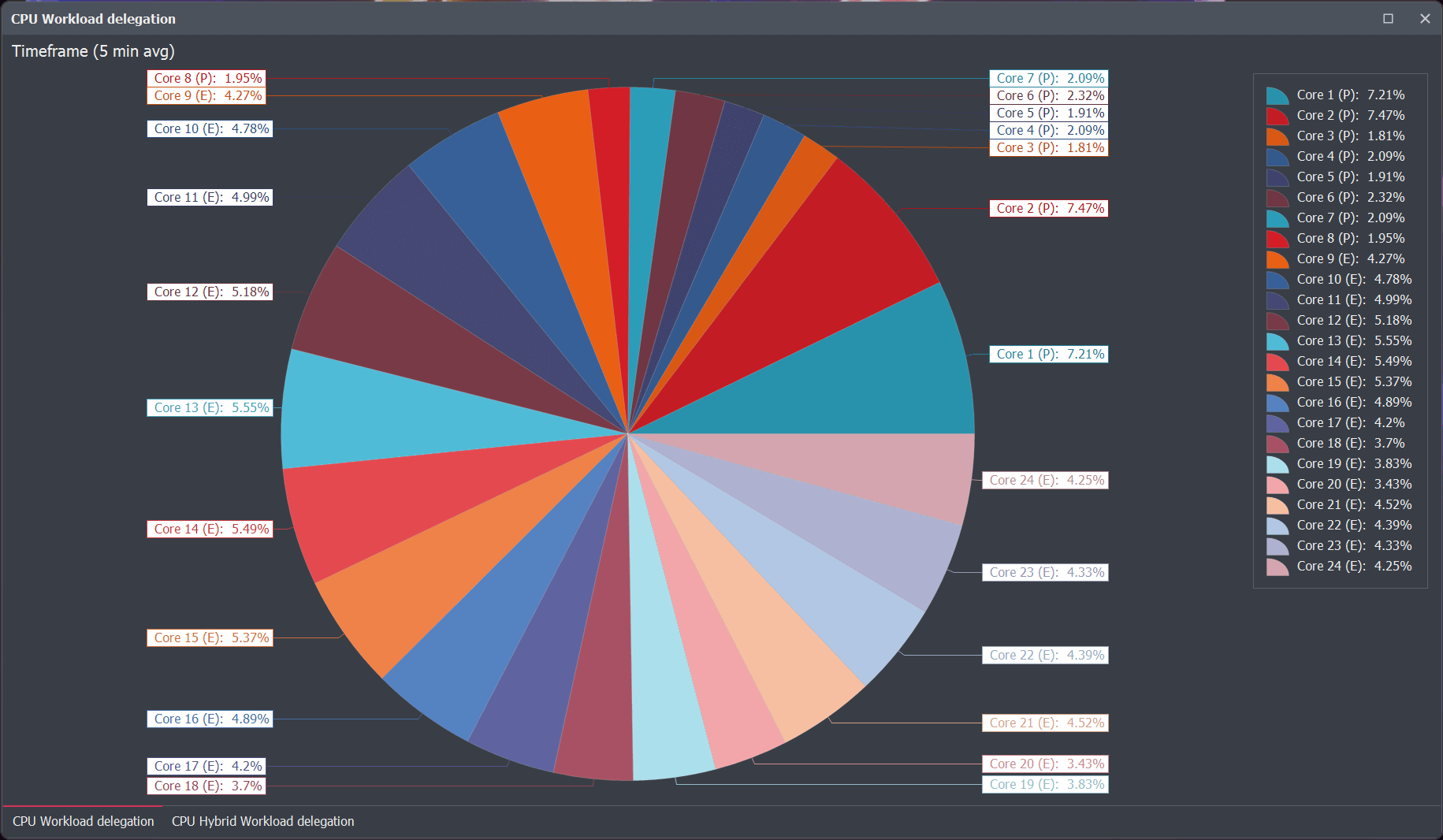
The CPU Workload Delegation chart provides a visual representation of how the operating system distributes workload across all CPU cores. Displayed as a pie chart, each slice corresponds to a specific CPU core and represents the percentage of the total workload that has been assigned to it.
This chart helps users identify workload distribution imbalances and monitor how efficiently the OS scheduler is utilizing the available CPU cores.
Chart Behavior and Interpretation
- Each Slice = One CPU Core: The size of each slice is proportional to the total workload delegated to that core over the specified time window.
- Label Details: Core labels displays the core number and the exact percentage of total workload it received.
Comparison to Load Distribution
Unlike the Load Distribution chart, which shows how much of a core’s capacity was utilized, the Workload Delegation chart shows how much total work was assigned to each core, regardless of the core’s total utilization. This offers a more scheduler-focused perspective.
Time Window Configuration
The chart calculates average workload delegation over a configurable time window. By default, this is set to 10 minutes. If the application has been running for less than this duration, the chart reflects the available runtime data.
You can customize the time window via: Settings → Time Range Settings → Data Distribution Chart Time Range.
This chart is particularly helpful for users monitoring multi-threaded performance, core affinity behavior, or testing scheduler efficiency under various workloads.
CPU Hybrid (P vs E Core Workload) Chart
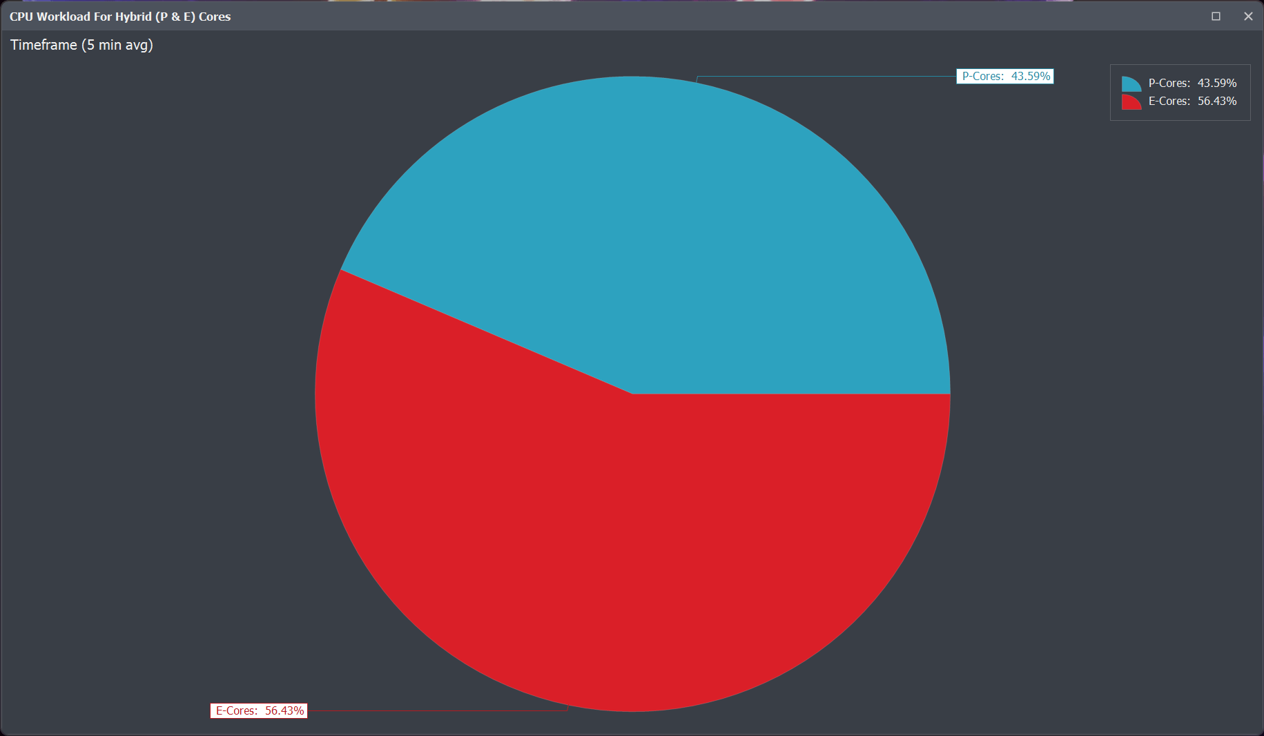
The Performance vs Efficient Core Workload chart is a pie chart designed specifically for Intel CPUs with a hybrid architecture, featuring both Performance (P) cores and Efficient (E) cores. This chart visually represents how workload is distributed between the two core types.
Each slice of the chart corresponds to either the P-core or E-core group, showing the percentage of total workload delegated by the operating system to each type over a specified period.
Chart Behavior
- Each Slice: Represents the total workload assigned to P-cores or E-cores.
- Hover-Over Details: Hovering over a slice displays the exact percentage of total workload each core type received.
- Hybrid Architecture Support: This chart only appears on systems with CPUs that include both P and E cores (e.g., Intel Alder Lake, Raptor Lake, etc.).
Time Window Configuration
The chart displays average workload distribution over a configurable time frame. By default, this time window is set to 10 minutes. If the application has been running for less than 10 minutes, it will reflect the data collected so far.
To change the time window: Options → CPU Chart Settings → Maximum Time Range for Charts Average Data
Use Case
This chart is especially useful for users who are adjusting Windows Heterogeneous Thread Scheduling or Power Settings to control which types of cores should be prioritized. It helps evaluate how well the OS is delegating workloads according to the configured policy.
By monitoring this chart, users can verify whether tasks are being appropriately routed to P-cores for high performance or to E-cores for power efficiency, allowing for better optimization of system responsiveness and power consumption.
About Our Software
Enhance and monitor system performance, customize favorite settings and more…


